
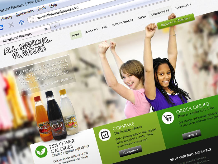


Responsive Design: Designing layouts that adapt to any device.
Responsive design ensures that interfaces adapt seamlessly to different screen sizes and devices, providing a consistent user experience.
It is a foundational principle of modern web development, influencing layout, typography, and interaction patterns.
Use case:
Mobile-first sites
>Cross-device applications
Strengths:
Improved usabilityBetter accessibilityScope:
frontend
Audience:
startup
>enterprise
>agency
Categories
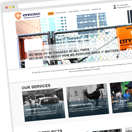
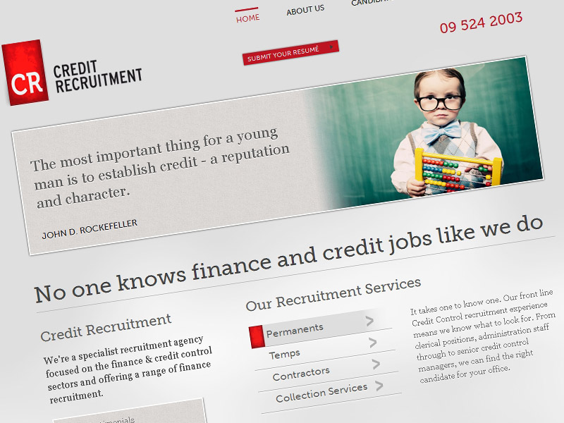
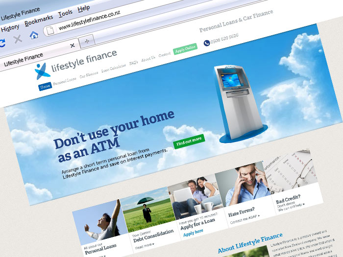
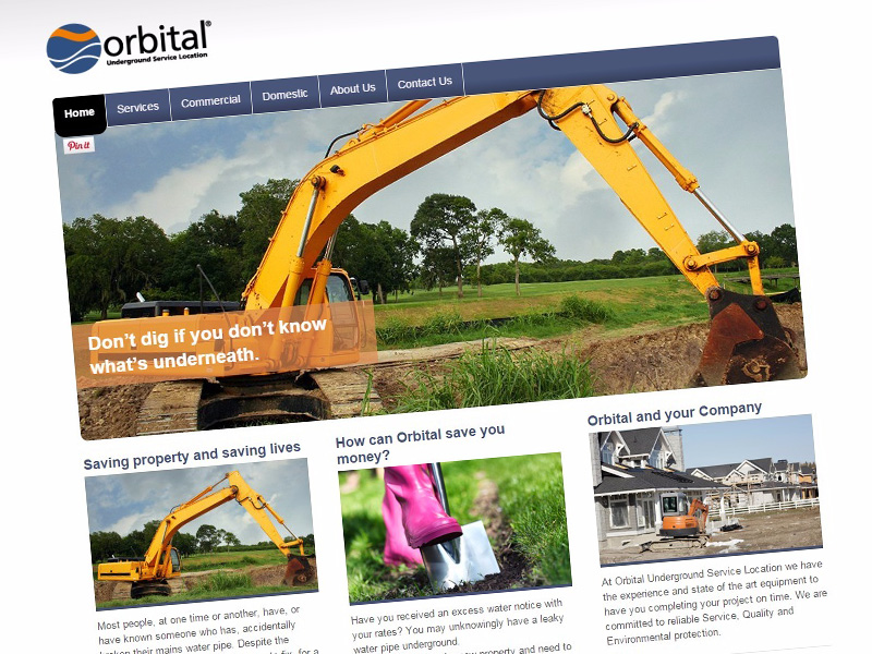
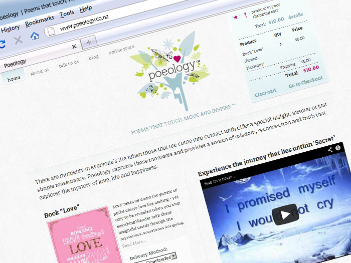
Some of the powerful projects I build recently.
Pattern separating an app into Model, View, and Controller.
A web framework by Google for building dynamic apps.
A JavaScript library for building user interfaces.
A JavaScript library for building user interfaces.
JavaScript runtime for server-side development.
Content management system used for website creation.
The creation and maintenance of websites.
Remote computing services over the internet.
Online buying and selling of goods and services.
Creating visuals and user experiences.
Designing systems, including cloud-based structures.
Software that is freely available for use and modification.
Tools that simplify development tasks.
A single repo containing multiple projects.
Languages for scripting and front-end development.
Building the user-facing parts of websites.
Server-side logic and database management.